Imagine yourself going into a cookie shop and paying with a credit card. What kind of emotions would you feel? Are you proud, embarrassed, or nonchalant? I’m going to guess that you feel indifferent because you are handing a piece of plastic with your name and card brand on it. In order to have answered “proud,” you need to have one of the American Express Black cards or other “exclusive” cards given to the top 1%.
In South Korea, there’s one card that you’ll actually see people posting about on Instagram –the Hyundai Card. However, the Hyundai Card didn’t achieve this success overnight. The company struggled in the first three years as competitors such as Samsung exceeded 25% of the market share while Hyundai accounted for only 1.7%. To make matters worse, it could not escape the shadow of its parent company, Hyundai Motor, as it was considered a legacy brand in Korea with a deep history.
However, let’s explore how Hyundai turned their brand around and has now come to embody a RED (Relevance, Ease, and Distinctiveness) brand.

Terms to note:
- Hyundai Card: Company name
- Hyundai card: Hyundai Card’s card
Relevance
Cultural Relevance: The key to global cultural experiences
Cultural Relevance is all about “giving your user a reason to feel connected to your brand,” whether that be through specific symbols or the company’s mission. With Korean credit card companies, there was no real reason for the user to be known as a “Brand A card user” or “Brand B user” because credit cards were simply a tool for a transaction and nothing more. However, the Hyundai card was the first in the category to crack tapping into cultural dynamics in Korean culture by: (1) understanding that Western culture was aspirational and (2) noticing how the younger generation was taking more interest in cultural experiences like going to museums. Realizing these shifts, Hyundai Card started to partner with icons in different areas of modern global culture: Billboard artists (music), MoMa (art), Monocle Magazine (international affairs), and Michelin starred restaurants (culinary). While traditional credit card companies would have stopped at just using these icons or brands on their ads, Hyundai Card took a step further and organized and hosted events, so its members could have a seat in participating in the cultural icons of that year:


- Super Concerts: Hyundai Card brought world-renowned artists such as Beyonce and Paul McCartney to South Korea for the first time in Korea past the stage of listening to K-Pop artists and in tune with global pop culture.
- Monocle Magazine: This helped consumers to feel like they were updated with international affairs, trends, and culture.
- Michelin Restaurant Week: This allowed consumers to feel in-tune with the global food scene.“I don’t eat some burgers at fast food to fill my daily calories but I treat food as an experience.”
Through these partnerships, Hyundai card users were able to build their identity of being someone who partakes in the creme de la creme of modern culture. As a result, Hyundai cards became a must-have item and even a status symbol for cultural trend-setters.
Social Relevance: Talk of the town
At Collider, we often use the term “party talk worthy” to describe Social Relevance, and I cannot agree more with how fitting the description is. To be more specific, in the RED book, Social Relevance is defined as “the ability of a brand to constantly be the topic of conversation in social circles, usually by creating unexpected stunts and actions.” And Hyundai Card does an excellent job of keeping its brand name circulating in Korea by consistently hosting big-name artists’ concerts two to three times a year. And when we do the math, Hyundai card users can get up to 20-30% discount, which is by no means a small amount. Therefore, it is natural that Hyundai Card’s name and its events are brought up in a pop-culture enthusiast’s conversation and be the most tweeted about concert in Korea, increasing in-wallet market share increases among customers who frequently attend concerts.
Besides just sponsoring an artist or brand, Hyundai Card has also been at the forefront of creating cultural spaces for its members to enjoy which also led to social relevance. When Hyundai Card Design Library opened in 2013, Koreans were having sort of a “mid-life crisis” as people began to question the meaning of overworking and hectic life. Naturally, Koreans’ desire to unplug and escape from all the business amplified. So when Hyundai Card announced that it’ll open the library in the heart of Hanok Village, one of the most classic places in Seoul, the cardholders felt like insiders when they were talking to friends. The combination of buzz-worthy books (70% of all books are the first editions or rare copies to be introduced in Korea) and limited access for members-only made the Hyundai Card the center of conversations. After building the library, Hyundai Card has enjoyed an increase in new users without almost any traditional advertising methods (TV, paper, etc.). And even in 2020 in the middle of pandemic, over 1 million visitors visited the library.


One might not see the profit in numbers right away (sales overnight), however, each activation and collaboration that the brand does builds the brand’s identity of being a global cultural icon (brand over time). Thus, the Hyundai Card naturally became the aspirational credit card in Korea, attaining the status as number one credit card company with an increase in new users.
Functional relevance: Redefining benefits
Typically, benefits for a credit card translate into mileage or points based on card use. I personally have the card that awards me Korean Air mileage; but to be honest, I rarely feel the tangible benefit since I can’t check the mileage on a daily basis. There’s no big profit from the credit card company’s point of view either. This is where Hyundai Card becomes the disruptor and introduces the “Save Point” system that utilizes its parent company, Hyundai Motor Company. The Save Point system is the first pre-discount system for users. So when purchasing Hyundai cars with Hyundai cards, they receive a discount of up to $500 depending on the type of car, and card users repay the discount with points accumulated by credit card use within three years. In other words, it is a concept that promises to get a discount on cars first and use cards as much as promised. This idea shocked the market and people who believed in “usage → benefit” as a natural principle. The transition to “benefit → usage” was a major breakthrough that changed the purpose of using the card itself. Benefits were no longer a by-product but the front face of credit cards.
As users could utilize points so that they’ve never been able to, card usage patterns changed where people created Hyundai Card for discounts and continuously used Hyundai Card to pay back. Hyundai Cards that were sleeping on one side of the wallet began to appear frequently and provided a reasonably convincing reason for people to transfer to Hyundai Card. In particular, the power of Save Point is shone more when purchasing expensive products such as cars. The benefit of cutting hundreds of dollars right away the moment you buy a car came as attractive to consumers. With this shocking yet functional benefit, Hyundai Card recorded the second-largest domestic market share in 2010.
Ease
Easy to Notice: Typography marketing
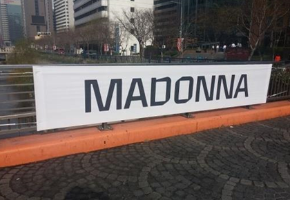
In the winter of 2014, when Hyundai Card released a poster with a simple print of “MADONNA” on a white background without photos or explanations, people noticed right away that it was a teaser for a Hyundai Card’s Super Concert. How did people connect such a simplistic poster with Hyundai Card?
The answer is…the font.
In 2003, Hyundai Card became the first Korean company to develop its own corporate font Youandi, inspired by the shape of a credit card. Since then, Hyundai Card, Hyundai Capital, and Hyundai Commercial have been using the font for product branding and all official documents issued by the company.

The reason behind investing more in typefaces rather than logos like other companies is because the company believes that “good typography means more than words.” This is especially true as people spend more time on the internet; the average person receives every day about 105,000 words or 23 words per second in half a day (12 hours) (during awake hours). Thus, consumers are not as likely to recall brands that uses typical Times New Roman or Arial. Instead, having a consistent yet distinctive brand typeface and being a driving force behind solid brand identity and intuitively and efficiently building memory structures of Hyundai Card’s identity on the public’s minds.
Distinctive
Consistent and unique naming
Before the Hyundai Card, it really is not an exaggeration to say that all credit cards looked the same. Every card was either black or blue plastic with the brand logo, name, and card number. Then enter the Hyundai Card with ‘alphabet cards.’
Why the alphabet?
Back when Hyundai Card only had “Hyundai M Card,” where M stood for automobiles, other credit card companies were putting their parent company at the forefront; so for Hyundai Card, it was automatically Hyundai Automobile. In other words, marketing was based on the value of its parent company, not on the benefits of individual cards. Thus, many consumers did not know which card provided which service to which card company. Advertisements also focused on ambiguous concepts such as credit or a fancy lifestyle but did not give information about the cards themselves. So Hyundai decided to leverage its existing distinctive asset of having letters in the card name and changed the Hyundai M Card to “Hyundai Card M,” where M now stood for multiple benefits. Then they made H, R, O, A, K, V, F, and T cards, expressing different use cases. For example, Hyundai O Card was for people who frequently drove as O stood for cashback on oil.
Hyundai Card also consistently built the brand portfolio with the alphabet, making it distinctively Hyundai and helping its users to build long-term memory structures about the brand. So just by seeing a card with an alphabet, people will know it’s Hyundai’s credit card, like seeing a red and white striped bucket and knowing it’s a KFC bucket.

Key Points:
Relevance
- Cultural: Hyundai Card successfully tapped into the culture code of consumers finding Western pop/art culture highly aspirational and partnered with modern global brands
- Social: Hyundai Card was constantly the topic of conversation through consistently holding Super Concerts and creating ‘members’-only cultural spaces.
- Functional: Hyundai Card redefined the idea of credit card points so users could utilize points ahead of time.
Easy
- Hyundai Card developed their own font so it would stand out in broad reaching media and build distinct memory structures.
Distinctive
- Hyundai Card built a distinct brand portfolio of cards leveraging the alphabet, and they’ve done it consistently for the past 10+ years, so alphabet cards are now salient in consumer’s minds.